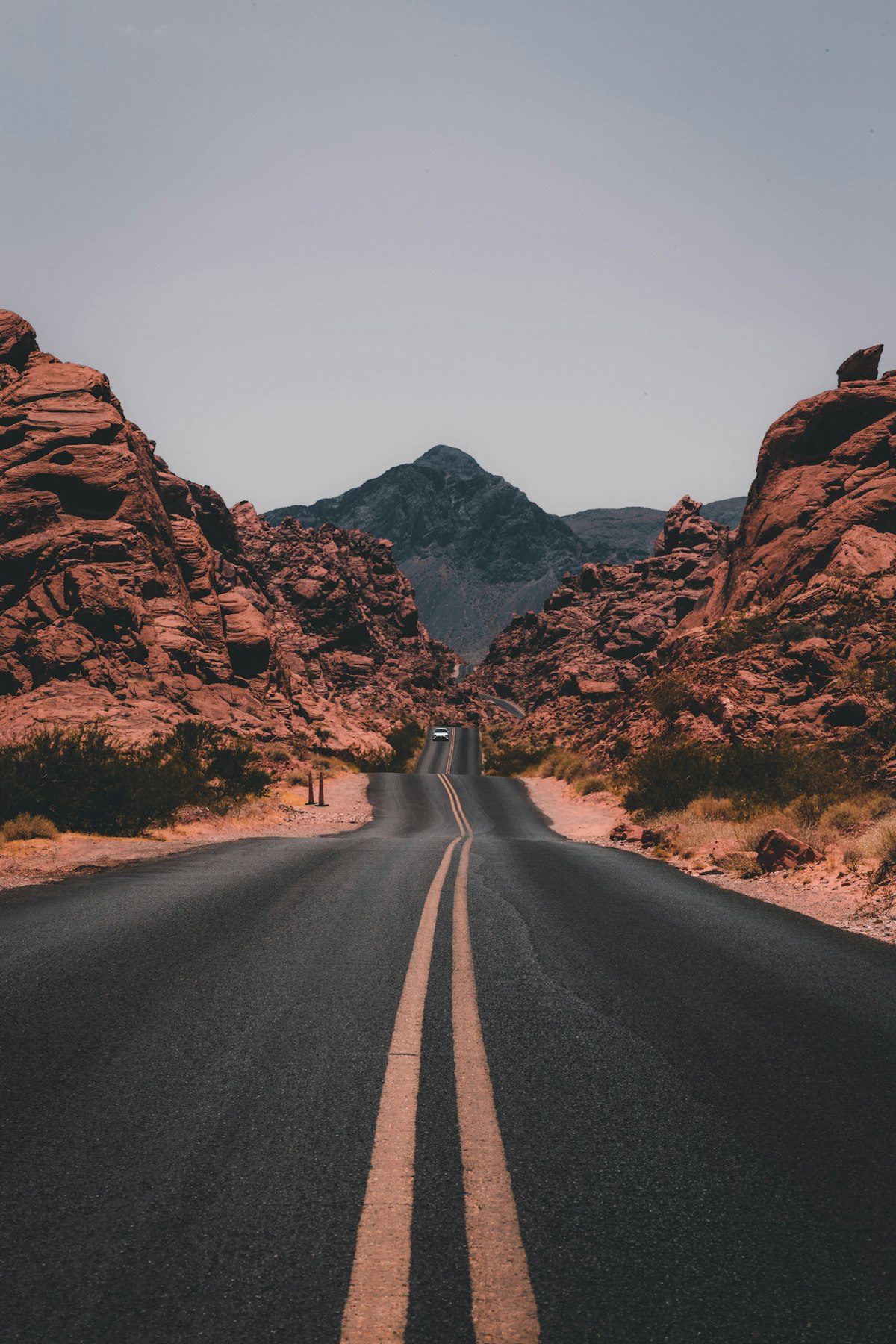
A box whose height follows its width at a fixed ratio, so media never shifts the layout.
<tp-aspect-ratio>
Aspect ratio
Default density
Compact density
Restart from the initial state
Show the copyable source
<tp-aspect-ratio ratio="1.7778" fit="cover" style="inline-size:100%;max-inline-size:36rem;margin-inline:auto;border-radius:var(--tp-radius-lg);overflow:hidden;background:var(--tp-muted)">
<img style="color:transparent" src="https://images.unsplash.com/photo-1500530855697-b586d89ba3ee?w=1200&q=80" alt="A winding road through green hills at sunset">
</tp-aspect-ratio>
Usage
Set ratio to width divided by height, such as 1.7778 for 16:9 or 1 for a square. The box takes its width from the container and derives its height, so content can’t stretch it. Always pass a ratio; the 16:9 default exists only for compatibility.
Invalid property assignments throw RangeError and preserve the previous valid ratio. Invalid attribute values also report the validation error instead of silently clamping geometry.
Ratios
Common ratios
Default density
Compact density
Restart from the initial state
Show the copyable source
Reserving the box before media loads prevents layout shift in feeds, galleries and video embeds. Width comes from the surrounding layout; the ratio is the only size input.
Container width
One ratio, three widths
Default density
Compact density
Restart from the initial state
Show the copyable source
Sidebar · 160 pxCard · 240 pxFeature · 320 px
Sidebar · 160 pxCard · 240 pxFeature · 320 px
<div style="display:flex;flex-wrap:wrap;align-items:start;gap:var(--tp-space-4)">
<figure style="margin:0;inline-size:10rem;max-inline-size:100%">
<tp-aspect-ratio ratio="1.7778" fit="cover" style="border-radius:var(--tp-radius-md);overflow:hidden;background:var(--tp-muted)">
<img style="color:transparent" src="https://images.unsplash.com/photo-1500530855697-b586d89ba3ee?w=600&q=80" alt="A winding road through green hills at sunset">
</tp-aspect-ratio>
<figcaption style="margin-block-start:var(--tp-space-2);font-size:var(--tp-text-xs);color:var(--tp-muted-foreground)">Sidebar · 160 px</figcaption>
</figure>
<figure style="margin:0;inline-size:15rem;max-inline-size:100%">
<tp-aspect-ratio ratio="1.7778" fit="cover" style="border-radius:var(--tp-radius-md);overflow:hidden;background:var(--tp-muted)">
<img style="color:transparent" src="https://images.unsplash.com/photo-1500530855697-b586d89ba3ee?w=600&q=80" alt="A winding road through green hills at sunset">
</tp-aspect-ratio>
<figcaption style="margin-block-start:var(--tp-space-2);font-size:var(--tp-text-xs);color:var(--tp-muted-foreground)">Card · 240 px</figcaption>
</figure>
<figure style="margin:0;inline-size:20rem;max-inline-size:100%">
<tp-aspect-ratio ratio="1.7778" fit="cover" style="border-radius:var(--tp-radius-md);overflow:hidden;background:var(--tp-muted)">
<img style="color:transparent" src="https://images.unsplash.com/photo-1500530855697-b586d89ba3ee?w=600&q=80" alt="A winding road through green hills at sunset">
</tp-aspect-ratio>
<figcaption style="margin-block-start:var(--tp-space-2);font-size:var(--tp-text-xs);color:var(--tp-muted-foreground)">Feature · 320 px</figcaption>
</figure>
</div>
The same 16:9 box keeps its shape in a sidebar, a card and a feature slot. Give it a width, or let the container shrink it, and the height follows.
Fit
Cover and contain
Default density
Compact density
Restart from the initial state
Show the copyable source
<div style="display:grid;grid-template-columns:1fr 1fr;gap:var(--tp-space-4);inline-size:100%;max-inline-size:36rem;margin-inline:auto">
<tp-aspect-ratio ratio="1" fit="cover" style="border-radius:var(--tp-radius-lg);overflow:hidden;background:var(--tp-muted)">
<img style="color:transparent" src="https://images.unsplash.com/photo-1501785888041-af3ef285b470?w=800&q=80" alt="Mountain lake at dawn, cropped to fill">
</tp-aspect-ratio>
<tp-aspect-ratio ratio="1" fit="contain" style="border-radius:var(--tp-radius-lg);overflow:hidden;background:var(--tp-muted)">
<img style="color:transparent" src="https://images.unsplash.com/photo-1501785888041-af3ef285b470?w=800&q=80" alt="Mountain lake at dawn, shown whole">
</tp-aspect-ratio>
</div>
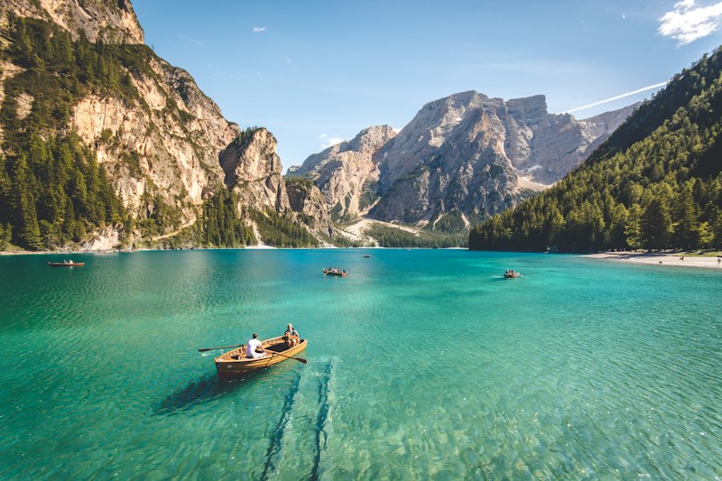
fit sets how images and video fill the box, like object-fit: cover crops, contain letterboxes and fill stretches. It never changes the ratio. The box adds no image semantics, so keep alt on the image itself.
API Reference
Every element also accepts motion-policy.
Attributes
AttributePropertyTypeDefaultDescriptionratiorationumber—The width divided by the height, such as 1.7778 for 16:9 or 1 for a square; always set it.fitfit'fill' | 'contain' | 'cover' | 'none' | 'scale-down''fill'How an image or a video fills the box: cover crops, contain letterboxes, fill stretches.
Slots
SlotDescriptiondefaultThe content that fills the box, usually an image or a video.
CSS parts
PartDescription::part(aspect-ratio-box)The box that holds the ratio; also exposed as root.::part(aspect-ratio-box-content)The layer the content fills, the full size of the box.
Related
Components, widgets and patterns that use this one.